“Square quote, which is the default way this block shows and makes the quote feel punchy and direct”
Option 4
This is a good layout for longer and more involved pages with several ideas to express. Each seperate idea can have the same general layout, with the image alternating sides to easily denote the differences.
“Another way to show the quotes under the text”
The next idea comes down and alternates. It’s interesting and can be repeated as many times as needed all the way down the page.
For added interest, or where two sections relate heavily to each other the images and text can next into each other, blurring the straight lines used above and being unusual on sites
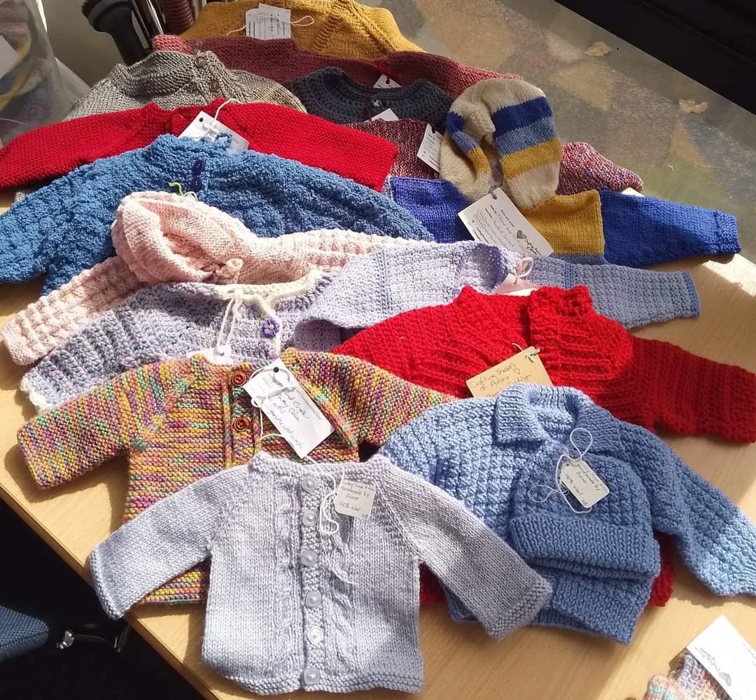
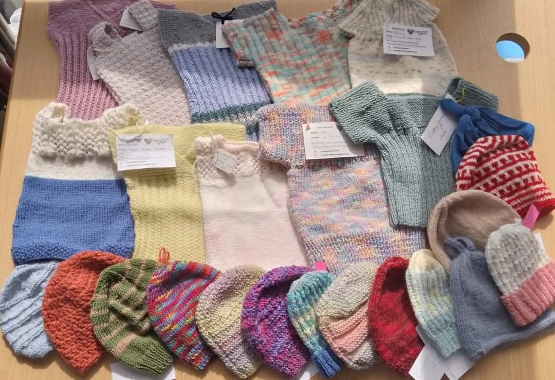
This could be very effective to look warm and welcoming. Sort of a cluttered yet open look for visitors. The gap the photos make can either be accepted, or could host a third picture in between, or a quote etc. Even a logo for a charity partner or ourselves if relevant. There are several options.


