Option 3
Another one best for shorter blurbs that are to the point. But the layout can repeat for longer ones, with each section making a different point.
The quote section may be best for the crafters or volunteers page, pulling things said from members and recipients of goods.
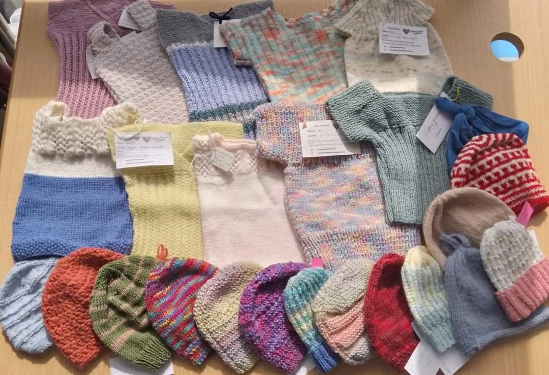
This section focusses on the words, pulling them into the centre of the page and forcing the eye to the middle. The photo then expands the eye, and the quote on the photo catches it. Quote could also be below the text instead, or even to the side which I put into option 4.

“The quote can appeal to the purpose of the page, and makes CToA more community focused to the reader”

